This spring, my client, Culinary Twist, launched a new line of sauces, American Classics Texan BBQ sauce. Studio Picotee's amazing new illustrator, Leslie Sademan, lended a hand while I was busy getting married and hosting lots of Austrian relatives, and she did an excellent job with this label design. Three flavors of sauce were developed, Hot 'n Spicy, Rich & Mild, and Chipotle Maple. Leslie and I were really excited to see the Rich & Mild and Chipotle Maple on the shelves at our local Whole Foods this week! We encourage you to stock up next time you're there - they will be perfect for your July 4th BBQ!
Saturday, June 23, 2012
Thursday, June 16, 2011
Studio Picotee label designs in the New York Times!

Studio Picotee's designs for Culinary Twist sauces were featured in a New York Times article today about Q.R. codes and smart technology used by small businesses. The labels were designed to connect the consumer with the concept of exotic foods they may encounter on an exotic vacation. But the technology employed on the back label, the Q.R. code, connects the consumer directly with the company, enabling them to find recipes and additional information to further their experience with the product.
What an exciting day to see my work in the New York Times! And I'm even more excited for my client, Culinary Twist, whose product I enjoy immensely. I had Baja shrimp on my salad for dinner last night! Yum!

Friday, February 13, 2009
Wednesday, January 28, 2009
It's funny what you find on the internet...
Every now and then I get a note from someone telling me they saw Studio Picotee's work somewhere online that I wasn't expecting. I guess it's a good thing to get this unsolicited press, but it'd be nice to know it's happening!
Just the other day, a vendor sent me a note saying she saw a write up on the design of the Wag Hotels pet store on the VMSD website. That was a nice place to be featured since it's a site that focuses on exactly the kind of work we do at Studio Picotee - retail store design, graphics, and merchandising.
Then I found that a similar and more in depth write up was used on the B&N website. B&N was the fixture supplier that I specified for the Wag store because of the versatility and simplicity. I'll admit, that despite a bit of a learning curve at the beginning, the fixtures ended up being very easy to use. The cables are a bit of a hassle, but in the end they looked good and will be easier now that they're up. Unfortunately Wag hasn't really utilized the cables since then to really take advantage of the versatility, but I think Wag is suffering from the same economy woes as everyone else. I hope that once things bounce back, we'll be able to get back in there and do some more fun window displays and store graphics.
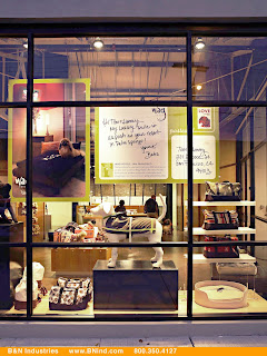
But in the meantime, it's fun to find ourselves online and the work liked enough to be highlighted as a case study!
Just the other day, a vendor sent me a note saying she saw a write up on the design of the Wag Hotels pet store on the VMSD website. That was a nice place to be featured since it's a site that focuses on exactly the kind of work we do at Studio Picotee - retail store design, graphics, and merchandising.
Then I found that a similar and more in depth write up was used on the B&N website. B&N was the fixture supplier that I specified for the Wag store because of the versatility and simplicity. I'll admit, that despite a bit of a learning curve at the beginning, the fixtures ended up being very easy to use. The cables are a bit of a hassle, but in the end they looked good and will be easier now that they're up. Unfortunately Wag hasn't really utilized the cables since then to really take advantage of the versatility, but I think Wag is suffering from the same economy woes as everyone else. I hope that once things bounce back, we'll be able to get back in there and do some more fun window displays and store graphics.

But in the meantime, it's fun to find ourselves online and the work liked enough to be highlighted as a case study!
Thursday, January 01, 2009
Brighten things up!
It's been a relatively busy end of the year, all things considered. In between jaunts to various conferences around the country and a holiday inspiration trip to the Christmas Markets of Munich, I did get to see two of my latest designs up and installed before the end of the year.
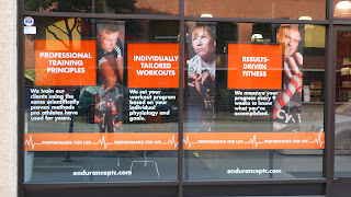
The first, a window display for Endurance PTC, a gym particularly focused on biking and triathalon training was installed on Front Street in San Francisco. The gym had big empty windows, and with all the foot traffic heading to and from downtown, it was a shame not to capitalize on that space to better explain what they do in there. We did a photo shoot of their clients on bikes and used their punchy orange to call out the benefits of the gym. Hopefully people looking to prepare for their New Year's Resolutions will be inspired to walk in on their way to or from work this January!
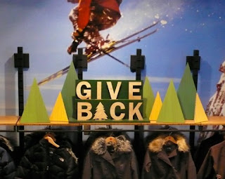
Then, for the holiday season, I worked with the North Face again on their Holiday graphics. Unfortunately, due to the changes in the marketplace and their own internal changes, we didn't end up executing the window display that we had worked on, but the in-store overheads did go up, and added a nice layer of texture to the store.
Studio Picotee is really looking forward to 2009. As Steve Jobs always said when I was working at Apple, "It's time to innovate through the downturn." And that's exactly what I hope to help my clients do. This is the perfect opportunity to reassess marketing programs and come up with new ideas that are both innovative and cost effective. As a small studio, we are perfect to help out on both fronts.
Here's to a fresh start to a new year! Cheers!

The first, a window display for Endurance PTC, a gym particularly focused on biking and triathalon training was installed on Front Street in San Francisco. The gym had big empty windows, and with all the foot traffic heading to and from downtown, it was a shame not to capitalize on that space to better explain what they do in there. We did a photo shoot of their clients on bikes and used their punchy orange to call out the benefits of the gym. Hopefully people looking to prepare for their New Year's Resolutions will be inspired to walk in on their way to or from work this January!

Then, for the holiday season, I worked with the North Face again on their Holiday graphics. Unfortunately, due to the changes in the marketplace and their own internal changes, we didn't end up executing the window display that we had worked on, but the in-store overheads did go up, and added a nice layer of texture to the store.
Studio Picotee is really looking forward to 2009. As Steve Jobs always said when I was working at Apple, "It's time to innovate through the downturn." And that's exactly what I hope to help my clients do. This is the perfect opportunity to reassess marketing programs and come up with new ideas that are both innovative and cost effective. As a small studio, we are perfect to help out on both fronts.
Here's to a fresh start to a new year! Cheers!
Thursday, September 11, 2008
Studio Picotee Celebrates 2 Years!
I am so excited to be sharing with you that Studio Picotee has officially entered our third year in business as of 08-07-08! I would have sent this note out on that day, but we've been busy working on all sorts of exciting projects and traveling to inspiring conferences lately.
Over the last year we have seen some of our client relationships grow deeper, giving Studio Picotee new opportunities within an already familiar brand, as well as taken on new clients to further broaden the scope of services we offer and subject matter we explore. At one point I had envisioned focusing my business on an area of expertise and/or a niche specialty, but the more projects we take on, the more I enjoy the whole range of subjects and variety of design challenges. The common thread I have found in our projects is Brand, something important to providing a foundation for and consistency within any project. The end product of our projects is less about the media assigned to it, but more about solving the creative problem while maintaining the strongest brand message.
Many of the projects from this past year have been updated on our website ( http://www.studiopicotee.com ), but I'll tell you a little more about a few of them here.
Some of the projects for new clients that are recently finished or currently in the works are:
• Window displays for Endurance PTC, a high-end bike gym in San Francisco
• Naming, branding and collateral for UC Berkeley's Geospatial Innovation Facility, a place where students, faculty and the community can learn about and use geospatial imaging technology
• Packaging labels for Bowser Beer by 3 Busy Dogs, beer for dogs (yes, it's for real, you can even get it at a pet store near you! http://www.3busydogs.com/stores)
• Website design for Music and the Holocaust, a comprehensive site with numerous articles, photos and recordings.
In addition to these new clients, Studio Picotee has continued to work with some who have been with us from the beginning.
The North Face continues to provide challenging design concepts for their window graphics and store signage, as well as a few corporate projects as well. The Back-to-school/Antarctica windows just came down, or I'd send you to a store to check them out. But stay tuned for Holiday where I have two rounds of window graphics and signage that will be going into the stores. A corporate timeline is also in the works, although it keeps evolving format. Last I left it, it became a video display at a sales meeting. I'm looking forward to see where it goes next.
Power of Two has grown and expanded their product offerings, and Studio Picotee has grown with them. We have gone from making little flash games to creating website mini-sites ( http://www.youmeandbaby.com ) and adapting their concept, process and technology to interactive employee training for businesses like the Gap and Old Navy. On these projects I continue to act as art director and designer, often providing content and direction to a team of illustrators, designers, animators, and programmers.
And lastly, as a side project dear to my heart, I'm in the development phases of a grant application from the National Science Foundation for Artists and Writers to go to Antarctica to research a project that they then come back and produce in order to help promote the environmental and scientific preservation of Antarctica. I know this sounds a little out of left field, but take a look at my site ( http://www.studiopicotee.com/antarctica ) to get a little more info on where I'm coming from. I'll continue to update this site as my project proposal takes shape. And If you're interested, there are many ways I could use the help of my community to fulfill the goals of creating a "broader impact" in the community as a result of the execution of my project.
Thanks for making it through my update! I really appreciate the support I get from all of you as clients, colleagues, and friends.
Tuesday, September 09, 2008
The shape of things to come

I was browsing through my photos from college tonight, and when I came across this one, I realized I had come completely full circle. In college, I worked at the Yale Co-Op as a "Visual Display Assistant." I didn't really know what that meant, but I knew it was a cool job, and I got to be creative and do fun stuff and get paid to do it. My boss, Johnette Luxeder, had been in the world of visual merchandising with Macy's and other big department stores for years, and she taught me the basics of store displays. We had fun working on these windows together, cutting out giant foam core shapes by hand. I remember cutting out that snowman. And I was particularly proud of a polar bear I did for the window next door. I thought I had the best job in the world.
And I still do. Little did I know, that 12 years later, I would be re-creating that holiday window of North Face product, complete with trees. That's what I'm working on right now, looking for inspiration for the perfect tree shapes for the Holiday '08 design concept. There will be no fake snow in this year's North Face window, but there will be trees. And jackets. Look out for it coming to a window near you in November!
Subscribe to:
Comments (Atom)


